 Click photo for music info
Year: 2011

The North Shore/Salem YMCA Could Use Your Vote

Hey Joe,
The North Shore/Salem YMCA is in the running for $50k in funding from Pepsi’s Refresh Everything Campaign, and they need people to vote. The funds will be used to renovate an existing space to create a Youth Creative Arts Center at the Salem Y. Voting ends tomorrow and you can vote with your Facebook account. Can you help spread the word – if they win this $50k will benefit a lot of kids on the North Shore.
http://northshorekid.com/story/50k-grabs-salem-ymca-needs-your-vote
Thanks,
~Bill O’Connor
North Shore Kid
Spread The GMG Love By Sharing With These Buttons:

Ed Collard Wins Art Rocks! Lobster Buoy- Investigation To Ensue
Ed somehow managed to walk away from the Art Haven Lobster Buoy Auction with the Art Rocks! lobster buoy sketched by GMG’s Paul F. Frontiero Jr. An investigation into allegations of malfeasance and skulldudgery ensue.

Spread The GMG Love By Sharing With These Buttons:

Did You Know (Sunset)

That Sunset or sundown is the daily disappearance of the Sun below the horizon as a result of Earth’s rotation.
The time of sunset is defined in astronomy as the moment the trailing edge of the Sun’s disk disappears below the horizon in the west. The ray path of light from the setting Sun is highly distorted near the horizon because of atmospheric refraction, making astronomical sunset occur when the Sun’s disk is already about one diameter below the horizon. Sunset is distinct from dusk, which is the moment at which darkness falls, which occurs when the Sun is approximately eighteen degrees below the horizon. The period between the astronomical sunset and dusk is called twilight.
Sunset creates unique atmospheric conditions such as the often intense orange and red colors of the Sun and the surrounding sky. (From Wikipedia).
These are a few captures of disappearances of the sun below the horizon, and the resulting unique atmospheric conditions, as viewed from Annisquam.
E.J. Lefavour
www.khanstudiointernational.com
Spread The GMG Love By Sharing With These Buttons:

Sunrise On The Back Shore Photo From Donna Ardizzoni

Spread The GMG Love By Sharing With These Buttons:

The 7th Annual Annisquam Village Church Talent Show February 5th
The 7th Annual Annisquam Village Church Talent Show
Saturday, February 5, 2011
Woof, wag and whine as friends, neighbors and perfect strangers share
their flair for the comic, the tragic and everything in between!
A barking mad time for all!
*ALL PROCEEDS WILL BENEFIT HAITI PROJECTS*
6:00 gathering (soft drinks, coffee and tea provided)
6:30 Pot Luck Supper – Bring a dish to share!
7:45 THE SHOW!!!
$10 for adults, $5 under 16, $30/family max.
Share Your Talent! Contact Terry Sands at
alexander.sands@jud.state.ma.us or (978) 283-7065
RESERVATIONS RECOMMENDED! avchurch820@gmail.com OR 978-281-0376
For now,
Suzanne Brown
617.678.1075
Annisquam Herb Farm
http://annisquamherbfarm.blogspot.com/
Spread The GMG Love By Sharing With These Buttons:

First Look- Palermos Brick Oven Pizzeria
In the former space of Trupianos ,The Causeway second location, Andiamos, Culina Café and now Palermos Brick Oven Pizzeria. 63 Washington Street Gloucester MA
My prosciutto, basil, mozzarella and tomato sandwich was fantastic.

Click the pictures of the menus to see the the full sized versions.


Spread The GMG Love By Sharing With These Buttons:

Model In The Studio, From Deb Clarke
From Deb Clarke;
from the archives: Model in the Studio copyright 1997
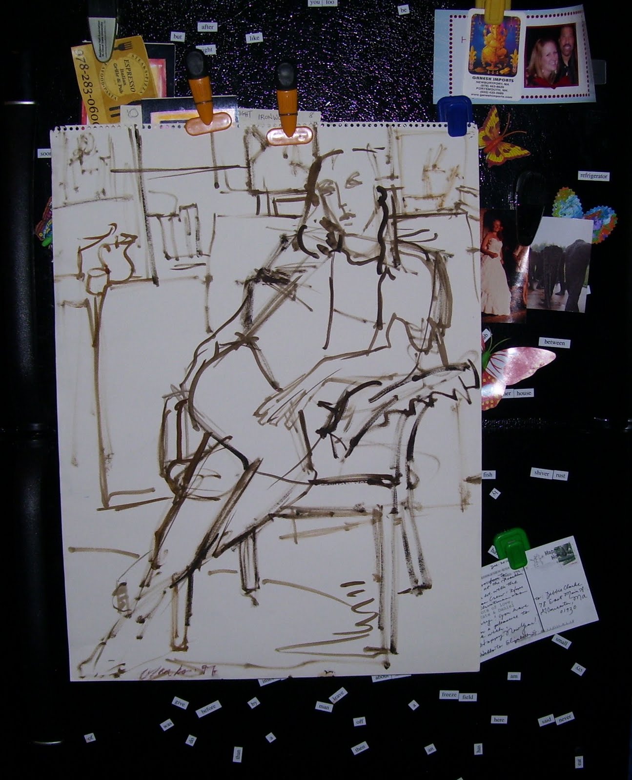 I think this is Brenda Tredwell. She was my model and studio assistant for several years. This drawing is turpentine wash on acid free paper. Use blotter paper or absorbant cardboard as a palette, this will reduce the linseed oil. The reverse of this drawing has one small bleedthrough, with no sign of decomp. This drawing pleases me.
Brenda grew up on Monhegan. Her hair flames. She calls herself a rock rat. She modeled for Jamie Wyeth. I recognized her knees and hair that matched the color of Jamie’s ‘burn barrel’.
enjoy.
deb.
Spread The GMG Love By Sharing With These Buttons:

At Stage Fort

Spread The GMG Love By Sharing With These Buttons:

Drilling Down n The Perfect Set Of Favicons Part III
The previous set of favicons from part II

While Bill did a great job with the set of favicons produced above there was still some minor tweaking to create what would be in my mind the perfect set.
Firstly the yellow ones will not be used because as I said in part II blue is part of the GMG brand.
Secondly, I noticed that there is a blue border around the favicons. While that wouldn’t bother me, I noticed on my iPad that when Apple modifies icons for use as buttons on their screens that the rounded corners accentuate and make them look hacked as the borders appear and then disappear at the corners.
See a screen capture from my iPad to see what I mean-

It may be nit-pickey but if we’re going to live with it for a while don’t we want to do it right?
My email to Bill-
OK here’s the question Bill. It seems but it just might be the way they get put on screen that there is a black border around the edges. When they get put onto an iPad or iPhone is it possible to rather nave no border and just the blue so when the devices round the corners you wouldn’t see those lines?
because in that case I would appreciate the larger ones blue with text bundles with the smaller ones without and actually I’m not sure if it was possible and I don’t want to be a total PITA but in the smaller ones take out the crooked black bar at the bottom all together and just have the blue background with the black silhouette of the seagull so that the seagull can be larger without the black crooked bar on the bottom.
So the smaller ones blue background with just the gull
the larger ones with the gull/crooked black bar on bottom with GMG text
again I want you to be perfectly honest and feel free to let me know if I’m asking too much. I don’t want to be a PITA but i think I now understand the benefits of being able to bundle all these different style images for the different places they would reside.
oh and even if you dont feel like doing it, thanks, these have been interesting blog posts that I’ve been able to share with the readership (the process)
Here is the set Bill came up with based on my Pain in the Ass tweaking request-
![]()
Bill writes-
Joe, you’re not a PITA, you’re a ROYAL PITA! Seriously, though, if I wasn’t enjoying this I wouldn’t be doing it.
I think I understand what you are asking, so I made a new mock up. The border edges have been removed. Larger than 32×32 have the GMG text and the smaller versions are stripped out. In the mock up you’ll notice the smaller icons have two versions. One without the black band on the bottom and the other with it. I did this because the ones without the band lowered the gull to the bottom edge of the image and it looked kind of funny to me [I’ve been tweaking these at a magnification of 500% so my perception of them is certainly skewed]. To raise the gull back up I had to add something for it to stand on. I tried adding a column to represent a dock pillar, but it looked stupid at 16×16, so I opted for the flattened black band. I just wanted you to have the opportunity to see the difference for the small ones and decide for yourself which one you prefer.
Also don’t forget this isn’t written in stone – and you can change for it in the future. I was actually gonna suggest that you can add a set for each season with different color backgrounds behind the silhouette to represent the season: Spring=green, Summer=yellow, Fall=orange/red/brown, Winter=blue.
The aren’t technically icons yet, they’re just the mockups. Once you’ve decided we’ll make them icons, bundle them into one icon, and test them out. Testing is a whole other clusterf#!k.
Let me know what you think.
Thanks,
~Bill O’Connor
North Shore Kid
Spread The GMG Love By Sharing With These Buttons:

Part 3 What is “Self” Publishing? From Kat Valentine– Before You Go To Press
Here is part 3. It is a little longer but I cannot emphasize the part in yellow enough! Thank so much!!!
Spelling and Grammar Matter
Thanks to the internet more people than ever are writing on a daily basis – they are blogging, Twittering, Facebooking, IMing, emailing, texting, etc. etc. However, all this writing has lead to a decline in basic grammar and spelling. This may be fine for everyday communications but that does not make it fine for books. Spell check will find words which are spelled incorrectly but it will not differentiate between there/their/they’re, point out words that are used incorrectly, correct punctuation, etc. There are also grammatical conventions for constructing things such as dialog that should be followed if you want your published work to look professional.
Authors who are not open to having their manuscripts proofed, edited, and critiqued should really consider whether they are serious about publishing. Professionals in the publishing business tell me that if an author resists editing and making changes they cannot work with them and will terminate the contract. While it is perfectly reasonable to resist significant content changes to a book (one of my agents wanted me to rewrite The Old Mermaid’s Tale for the Young Adult market — I refused), writers have to comply with standard grammar, punctuation, structure, etc. if they want to be taken seriously.
COMMIT TO QUALITY
Please remember this: when you publish a badly written, badly proofed,
badly edited book, you don’t just make yourself look bad,
you make all self-published authors look bad.
Readers are becoming increasingly sensitive to self-publishing and have no reticence
to give very bad reviews to badly constructed books.
As a self-publisher commit to the highest standards possible.

Preparing Files: Print Publishing vs. ePublishing
Remember: printed material is made of ink, electronic material is made of light.
Continued at: http://parlezmoiblog.blogspot.com/2011/01/part-3-before-you-go-to-press.html
Spread The GMG Love By Sharing With These Buttons:

Rick Moore- The Good Morning Gloucester Interview
Rick Moore- the head cheese behind MooreStuffOnline.com swings by the dock to have a chat.
Check out the site, they are starting to get into news more, in addition to the sports-centric site that it had been.
I hope I have the energy and passion for something the way Rick obviously does for MooreStuffOnline when I’m his age. The guy is a complete maniac! I’m not sure if he already drank 6 or 7 cups of coffee but you should see this guy in action. I’m looking forward to collaborating with him in the future.
A possible podcast guest Kenny?
Spread The GMG Love By Sharing With These Buttons:
Snow Dunes


Spread The GMG Love By Sharing With These Buttons:

Social Media for Artists (and non-profits)
Jo-Ann Castano presents-

it’s all about engaging eyeballs (and iminds) get started with the basics …
use FACEBOOK PAGES to promote your work
use LINKEDIN to connect to colleagues, businesses and resources.
participate in the global art (and nonprofit) conversation on TWITTER…..
move your message on YOU TUBE
Ten Pound Studio . 1 Center Street . Gloucester MA – Saturday, February 12 1:00 – 3:30 p.m.
presented by
Barbara Oliver (integrated communications consultant)
with preso by
Jo-Ann Castano (artist, community cultural organizer)
on The Arts Map-Cape Ann Arts Directory
registration on line coming soon
fee: $50 (includes how-to handouts)
email bthevision@gmail.com for further info
Bring your laptop, WFI available and explore the possibilities of marketing your art or organization.
Spread The GMG Love By Sharing With These Buttons:

The GloucesterCast Podcast Episode 2

Click here or the arrow below to listen to the podcast–
Hosts:
- Joey Ciaramitaro – creator of Good Morning Gloucester and co-owner of Gloucester MA Captain Joe and Sons lobster company
- Kenny MacCarthy – creator of The Cut Bridge and Gloucester MA real estate agent guru
Joey and Kenny discuss Gloucester / Cape Ann:
- recent happenings
- upcoming events
- local real estate trends
- dog and pet talk
- sports, technology, social media
- anything else that comes up along the way
Want to reach us?
- Joey’s Twitter Username @Joey_C
- Kenny’s Twitter Username @glosta
- Kenny’s Facebook Page
Episode 2 link mentions:
Podcast 1 Listener Comments
Sea Smoke & Kenny’s Sea Smoke Video
Farm Bar and Grille Bikini and Speedo Dodgeball
Cape Ann Animal Aid Fundraiser
New Spanish Restaurant Gloria’s Menu and Food Pictures
Theme Music
- Gloucester Til The End Theme Music is from Earl and Arch- you can download it for free at GimmeSound
Free Gloucester Til the End Download At Gimme Sound- Earl and Arch’s page
Please write in with comments, podcast ideas or things you would like to hear about in the next Episode of The GloucesterCast. We value your feedback.
Thanks from Joey and Kenny
GloucesterCast Podcast Archive Here
Spread The GMG Love By Sharing With These Buttons:

Coffee Infused Pumpkin Stout Only Available At Cape Ann Brewing Video
Learn about the hoppelator and how Cape Ann Brewing uses it to infuse flavor into it’s brews.
Spread The GMG Love By Sharing With These Buttons:
I See Crazy People- The Boys


MR HANKEY!

Spread The GMG Love By Sharing With These Buttons:

Did You Know (Blue Porch Ceilings)

why pale blue paint is used on the porch ceilings of many older homes in New England? There are actually a number of possible reasons. The blue paint is said to reflect light. To anyone standing inside the house, the day would seem brighter, even if it were overcast. Some say it keeps the porch cooler in summer. Still others believe that blue chases away evil spirits. In the South, especially in South Carolina, the ceiling porch blue is called haint blue (haint being a spirit or ghost) and is used to ward off evil spirits. Some people also believe that the color discourages insects that mistake it for the open sky and avoid it for fear of being caught in the open and eaten by flying predators. Some just do it because it is pretty.
E.J. Lefavour
www.khanstudiointernational.com
Spread The GMG Love By Sharing With These Buttons:

First-Ever Blue Shutters Beachside Inn Chili Cook-Off Set for February 12.

All guests need to do is bring a pot of chili for everyone to enjoy, and they get 25% off their weekend stay. Our judges – including Jeremy Goldberg from Cape Ann Brewing and Doug Silva from the Topside Grill and Pub — will choose a winner that Saturday evening, and the chili champion gets a gift certificate for a free return visit.
If folks would like to come and stay a night or two and just taste the chili, that’s OK too.
This could be a great way to spice up Valentines Day (just a few days later) — while we’ll be enjoying chili on Saturday night, there will be time for a romantic dinner downtown, a glass of champagne by the fire, a walk on the beach and much more.
Anyone who’s interested should call or email us to make a reservation and get in on the fun!
Ph: 978-283-1198
Email: info@blueshuttersbeachside.com
Spread The GMG Love By Sharing With These Buttons:

Art Haven Lobster Buoy Auction Pics From Ed Collard


